TaWRA Logo opinion poll
Recently a new residents committee was formed in my village, Trevone, called TaWRA (Trevone and Windmill Residents Committee) and in my spare time I knocked up a couple of logos - after all everyone organisation needs an identity. I thought I'd pop the designs on here for the committee to see, and if anyone else sees them their opinions would be very welcome too. :)
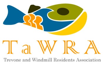
For those who don't know Trevone its a quaint little village by the sea in North Cornwall - most of us who live there think it's the most beautiful village in Cornwall, full stop. One of its distinctive features is a round crater like hole in the headland which was created by a massive cave collapse, this landmark together with the Madrips rocks are incorporated into both designs... anyways, replies, opinions, likes and dislikes most gratefully received.

PS Fonts, colours, etc all up for grabs this is just a first stab. We could always print tee-shirts etc to try and raise some money too.
Comments
I like the fish one! It's very clever and will appeal to younger ages as the other one is definately not as eye-catching. Good job :)
Posted by: Ella Reynolds | April 25, 2008 11:36 AM
Tim, well done once again for putting time, creative energy and thought into this. The fish on the right is more obvious and in-your-face, signaling sea, beach, fish, round hole, etc, but aesthetically, I love the one on the left and it is certainly the one I would like on a sweatshirt or t-shirt. The trouble is, it looks a bit like a sinister whale coming up out of the water... Maybe a combination of the two, ie the type-face you have used for the TaWRA lettering on the left instead of the more Council Office look of the one on the right (but keeping the fish)... IMO the lettering on the right has the look of headed paper and is not so trendy as the other one.
Posted by: jane Myles | April 25, 2008 12:13 PM
I love the fish one, especially as the scales look like a little gang of people. Though I prefer the more muted colours and lettering of the first one. Well done,both very clever. Jay x
Posted by: Jay Mcinnes | April 25, 2008 07:13 PM
I love the fish one, especially as the scales look like a little gang of people. Though I prefer the more muted colours and lettering of the first one. Well done,both very clever. Jay x
Posted by: Jay Mcinnes | April 25, 2008 07:14 PM
I find the left one stylish and at first liked it most, but then, the story on the right logo was too clever to ignore. That's the one for me.
Posted by: marie roddis | April 25, 2008 07:26 PM
I prefer the fish one. It is 'presses all the right buttons'
Posted by: Duncan McInnes | April 25, 2008 08:01 PM
We both love the colourful fish one - very apt for Trevone and windmill. Agree with Jane, colourful fish, but the other lettering. Mike & Jan. (Fisher)
Posted by: Mike & Jan Fisher | May 4, 2008 05:04 PM
For me,its got to be the right hand fish. The orange scales look like the silouettes of three people so it feels like it also represents the colourful characters in the village. Thank you once again Tim for your time, energy and passion.
Posted by: Julie Reynolds | June 14, 2008 06:54 PM
Outstanding work. For me they both look like fish, but I prefer the one with the beach and people. Keep the same colour font and the text but just change the font to that of the first effort. Once again I say the people of Trevone and North Cornwall are lucky to have such a shining star in their midst.
Posted by: David Wilson | July 1, 2008 09:18 PM