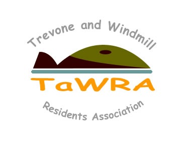
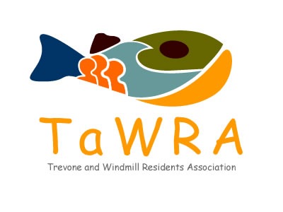
TaWRA logo based on feedback...
Well opinion is a little split so I have reworked both based on the feedback. Let me know what you think :)
By the way - use of orange is because it is a "unifying" colour and one that excites and promotes action.
See those of you on the IT group tomorrow at the Well Parc, 7pm.
Comments
Liked the first one best.
I liked the fish one, but it was all fish in the first instance if you know what I mean - even though everything was inside it. If you could somehow incorporate the people from inside the fish into the top one, I think that would be good - to focus on the people....and maybe make the brown bits a granite grey? Anyway, I thought they were inspired.
Sue (owner of famous dog in blog). :)
Posted by: Sue Whitmore | April 29, 2008 10:45 AM
You clever bugger! Really like the one on the left of mainly blowhole. Right hand design may be too subtle
see you soon
Julie x
Posted by: Julie Reynolds | April 29, 2008 01:58 PM
Now that you have reworked them, the top one is my favourite.The bottom one might have too much on it for a logo. However, they are both brilliant, what about making a tee shirt with either or both logos. They would sell like hot-cakes? Instead of TAWRA etc. the writing on them could be TREVONE BAY(above the picture in blue to represent the sky) and CORNWALL (underneath in yellow to reresent the sand).
Posted by: Duncan McInnes | April 30, 2008 03:19 PM
Tim -- I think the bottom one is good, it works at many levels so will connect with the most people. IMO the small writing is too tiny for a logo, but I do like the way the full name is laid out in the top one. The visual association with blowhole is excellent on both logos. paul f
Posted by: Paul Follett | May 7, 2008 04:03 PM